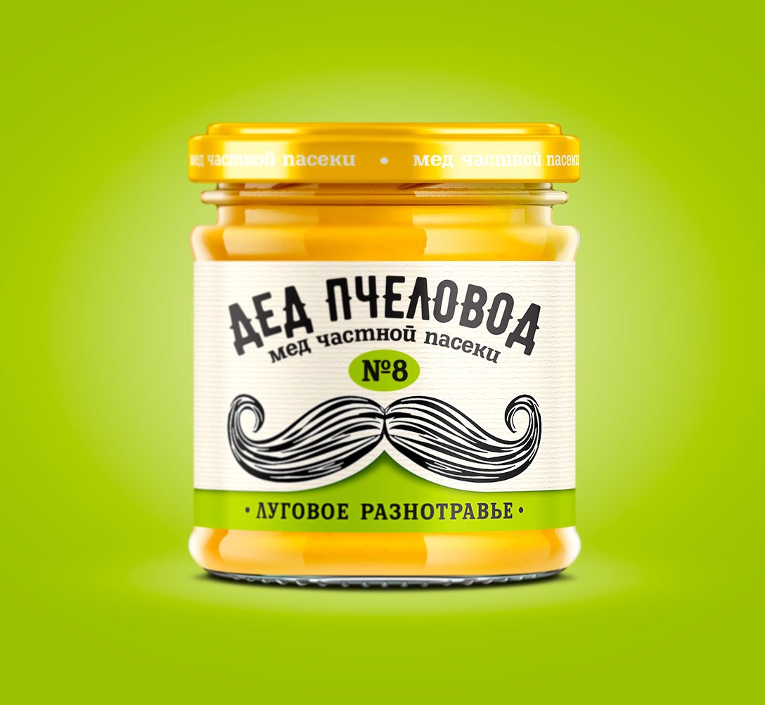
Grandpa Beekeeper
“Grandpa Beekeeper” — Honey Product Branding!
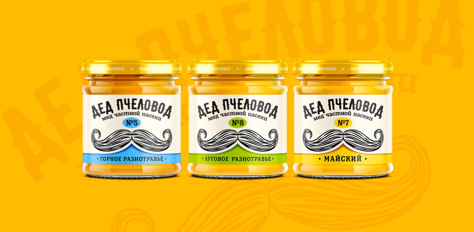
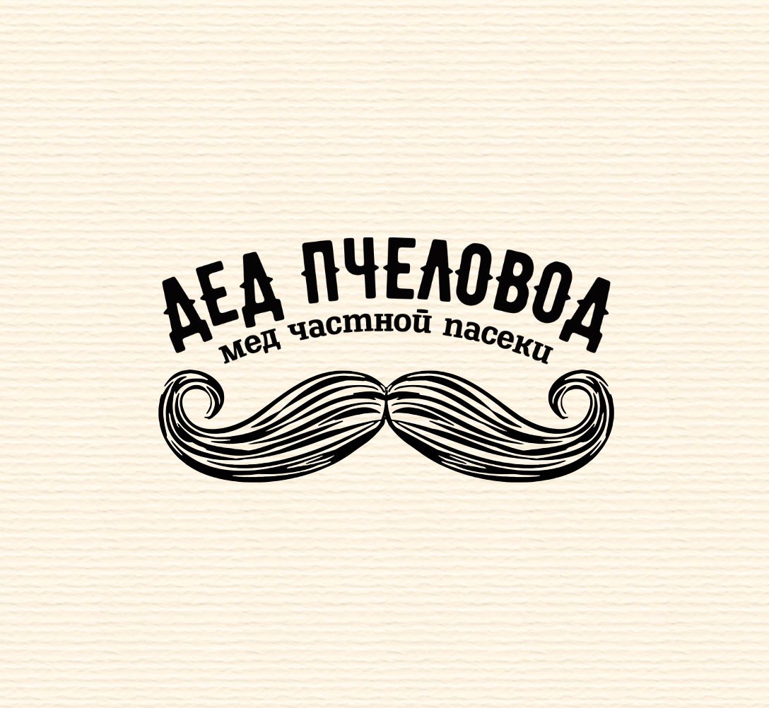
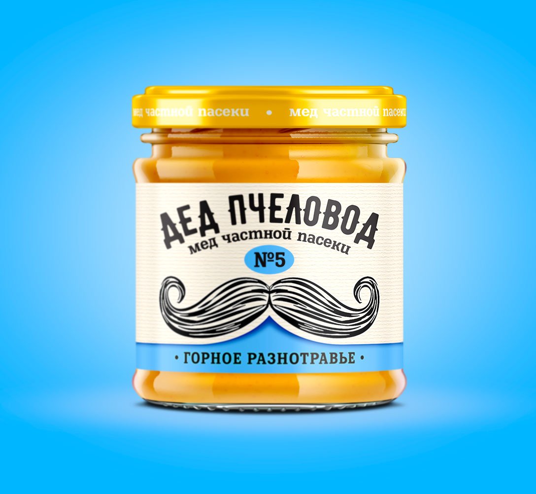
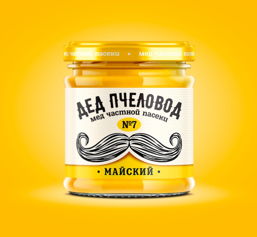
At Branding Agency «Like Brands,» we developed a design for a local honey producer. Our work included creating a logo, designing a label for the jar, and adapting it across different product lines. Our goal was to design a label that would strengthen the company’s image by emphasizing the «natural» and «organic» qualities of the product.
To achieve this, we decided to use a kraft background, which evokes trust in the product’s natural origins, and bright elements to make it stand out on the shelf. The logo, created in a vintage font, features an illustration of a mustached grandpa beekeeper, collecting and examining the best honey samples from his private apiary. This adds a touch of authenticity and highlights the product’s natural quality, setting it apart from competitors.
Our thoughtful design approach ensures that “Grandpa Beekeeper” honey conveys a sense of tradition and quality. The rustic kraft background, combined with bright, eye-catching elements, effectively communicates the product’s natural origins. The vintage logo and charming illustration of the beekeeper further reinforce the brand’s authenticity and trustworthiness, making it a standout choice for consumers seeking high-quality, natural honey.
