Additionally, the typography was carefully chosen to reflect the cultural theme, using elegant, flowing scripts that evoke the grace and tradition of Asian calligraphy. The overall design of “Aloe Sun” not only resonates with consumers seeking a healthy drink but also appeals to those with an appreciation for Asian-inspired aesthetics. Through our design, Branding Agency «Like Brands» has successfully brought the spirit of Asia into every bottle of “Aloe Sun,” creating a unique and captivating beverage experience.
Aloe Sun
Client: Rauan
Service: Branding, Packaging Design
Category: Packaging Design
“Aloe Sun” — Creating a Label Design for a Beverage!
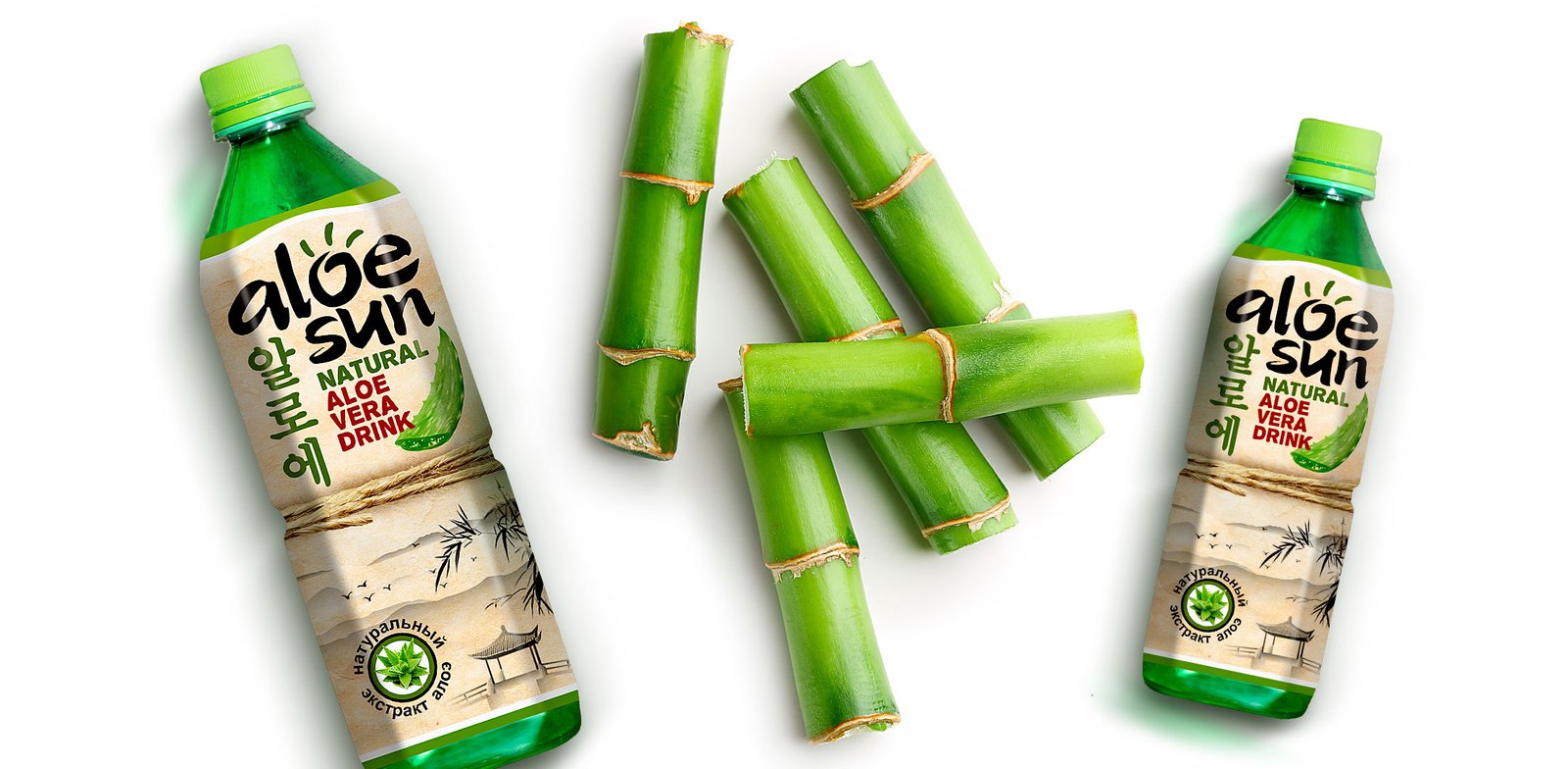
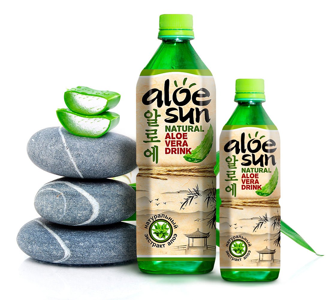
We had the opportunity to work on an exciting project to create a label design for “Aloe Sun,” a drink containing aloe. Aloe drinks or juices are in high demand in countries like South Korea, Japan, and China. With the growing popularity of Asian culture worldwide, Rauan, a leading beverage and juice producer in our country, decided to create a brand that immerses our consumers in the Asian environment without leaving the country. The brand name directly reflects its connection to Asian culture and the key ingredient of the product — aloe.
Branding Agency «Like Brands» crafted a design that captures the essence of Asian aesthetics. The craft background emphasizes the natural quality, while the Asian-inspired elements we developed add even more authenticity to the design. We included illustrations such as bamboo and pagodas, which are iconic representations of Asian style.
To enhance the appeal and visibility of the “Aloe Sun” beverage, our team incorporated vibrant, eye-catching colors that stand out on the shelf. The use of green tones highlights the freshness and natural benefits of aloe, while gold accents add a touch of premium quality. This combination ensures that the product not only attracts attention but also conveys a sense of health and wellness.